
Thursday, September 23, 2010
Friday, September 17, 2010


Wednesday, September 1, 2010


Friday, August 6, 2010
Sony NEX-3 / NEX-5 Review


Ever since Panasonic and Olympus created their Micro Four Thirds mirrorless system, all the talk has been about what the other players in the market will do. Micro Four Thirds has been steadily building its market share, seemingly without response from the three companies that account for over 80% of DSLR sales (Canon, Nikon and Sony), to the extent that 'Micro' risks becoming the generic term for these mirrorless systems ('When will Brand X make a Micro camera?' has become a fairly common thread title on our forums).
The waiting is now over as, following the showing of some mock-ups at PMA and a torrent of teasers and leaks, Sony finally officially announced its NEX system last month. The details are exactly what you'd expect - HD video capable APS-C sensors in small bodies. What might take you by surprise is just how small the bodies are - the NEX-5 in particular being tiny. In fact the cameras are too small to include in-body image stabilization units, as found in Sony's SLRs, and instead use lens-based 'Optical SteadyShot'. These NEX cameras will come under the Alpha brand but do not make use of the Alpha lens mount, instead using the completely new all-electronic E-mount.
Sony has made clear that it is aiming for compact camera users who wish to upgrade (a market it estimates at around 10 million potential buyers), rather than trying to offer a second camera for existing DSLR users. And the NEX models have more in common with compact cameras than DSLRs - including very few buttons and a resolutely unconventional interface.
As part of this interface it offers not only the standard Sony option of showing a small description of each selected option, it also has a full user guide built in to the camera. Relevant sections of this guide are available in each shooting mode to give hints and advice about everything from how to hold the camera to how to achieve an out-of-focus background.
The company told us that it felt its competitors had merely miniaturized, rather than revolutionized, so it's no surprise that the NEXs are more than just the company's SLRs with the mirrors removed. Instead you get a wholly new system with metal-bodied kit lenses (something we didn't expect to see again in a mainstream product), and an accessory port instead of a conventional flash hot shoe.
As with Samsung and Panasonic, Sony's background is electronics (rather than cameras) so the incentive to move away from the optically complex DSLR design to one based more around electronic displays makes sense. Sony's situation is a little different in that it bought the respected Minolta brand and know-how but, despite plenty of new models, it has only been able to make a big impression on the DSLR market in a few selected regions. Consequently, it's understandable that it might want to combine its DSLR knowledge with its electronics expertise to establish some compelling competitive advantage.
The NEX series will initially comprise two cameras - the NEX-5 and NEX-3. In terms of specifications, both cameras are essentially identical - the NEX-5 gets a slightly smaller magnesium alloy body, an infrared remote receiver and 1080i AVCHD movie recording, but in every other respect they're the same.
The thing that's immediately apparent about both NEX cameras is how small they are. Despite having sensors 50% larger than the Micro Four Thirds format, the cameras are smaller and thinner than either the Panasonic GF1 or Olympus E-PL1 compared here.
NEX-5
There's very little to the NEX-5's body beyond the handgrip and the flip-out screen but, despite its small size, it is easy to hold and encourages a stable two-handed grip. One of the only distinctions between the NEX-5 and its less expensive sibling, the NEX-3, is its magnesium alloy construction, which gives a really solid feel. The metal-bodied lenses further enhance this sense of quality.
NEX-3
The NEX-3's grip is flatter and wider than the NEX-5's, and overall we found it slightly less secure to hold than its pricier sibling. Your comfort may vary, of course, but in general we think the NEX-5 has the ergonomic edge. The NEX-3 may not have the magnesium alloy construction but it still feels solidly put together.
Lens compatibility
Three E-mount lenses are being announced alongside the cameras - an 16mm F2.8 pancake, a standard 18-55mm F3.5-5.6 stabilized kit zoom and a stabilized 18-200mm F3.5-6.3 superzoom. Although the company talks a great deal about shallow depth-of-field, none of the lenses initially offered will offer a great deal of control in that respect. Being based around an APS-C sensor as used in the majority of DSLRs, the NEX cameras are subject to the same 1.5x 'crop factor' as them, so a 16mm lens will give the same field of view as a 24mm lens would on a 35mm film cameras.
Three kits are available: the 'snap' kits which include the 18-55mm zoom, the 'go out with me' kits that feature the 16mm prime lens and the 'go out and snap' kits that include both. And, while we think a 24mm equivalent prime lens will make sense to somebody and are quite able to look beyond the comedy potential of calling a product 'go out with me,' we cannot make any sense of the decision to bundle such a potentially challenging lens with what we're told are point-and-shoot cameras.
The majority of people walking into camera shops will be very badly served if they leave with a camera and nothing but an ultrawide angle lens. And, still more disappointingly, despite its F2.8 maximum aperture, the 16mm lens will not offer much scope for blurring backgrounds, so shouldn't be sold on that basis either.
NEX-5 with 16mm F2.8 pancake NEX-5 with 18-200mm F3.5-5.6 OSS
Sony is also taking the unusual step of offering adapter lenses for the 16mm F2.8 pancake, which attach via a bayonet mount on the front. In a manner familiar from compact cameras, it will be possible to adapt the lens from its usual 24mm equivalent field-of-view using either an ultra-wide adapter to take it to 20mm equivalent, or a fisheye that gives a 16mm equivalent view.
VCL-ECF1 16mm equiv. fisheye adapter, which attaches to the bayonet mount of the 16mm F2.8 pancake lens. VCL-ECU1 20mm equiv. ultrawide adapter which attaches to the same bayonet.
An Alpha mount adapter will be available, giving the ability to use Sony and Minolta SLR lenses. The LA-EA1 adapter has a motor to control the lens aperture, but nothing to drive the autofocus (it can't currently focus SSM and SAM lenses with built-in focus motors either). We have no pricing for the adapter yet but suspect the additional mechanical complexity of providing aperture support may mean it's worth thinking very hard about how much it's really worth to retain compatibility.
LA-EA1 Alpha-mount to E-mount adapter
If you're new to digital photography you may wish to read the Digital Photography Glossary before diving into this article (it may help you understand some of the terms used).
Sony NEX-3 and NEX-5 specifications
NEX-3 NEX-5
Price (with 18-55mm zoom lens)
(with 16mm F2.8 pancake) • $599.99 / €549.95
• $549.99 / €499.95 • $699.99 / €649.95
• $649.99 / €599.95
Body material • Polycarbonate • Magnesium Alloy
Sensor • 23.4 x 15.6 mm Exmor APS HD CMOS Sensor
• 14.2 million effective pixels
Image sizes 3:2
• 14 MP (L)
• 7.4 MP (M)
• 3.5MP (S)
16:9
• 12 MP (L)
• 3.6 MP (M)
• 2.9 MP (S)
File qualities / formats • RAW
• RAW + JPEG Fine
• JPEG Fine
• JPEG Standard
Movie • MP4:
1280 x 720p 29.97fps (9 or 6 Mbps)
640x480 29.97fps • AVCHD:
1920 x 1080i 60/50fps (17Mbps)
• MP4:
1440 x 1080p 30/25fps (12Mbps)
Dust reduction • Coating on low pass filter
• Sensor-shift
Lenses • Sony E-mount
• Sony Alpha lenses, Minolta and Konica Minolta AF lenses via adaptor
(MF only, exclude power zoom lenses/tele-converters)
Image Stabilization • 'Optical SteadyShot' system on selected lenses
Auto Focus • Contrast AF
• 25 multi-point
• Centre-weighted
• Flexible Spot
Shooting modes • Intelligent Auto
• Program
• Aperture priority
• Shutter priority
• Manual
• Sweep Panorama
• Anti-Motion Blur
• Scene modes (below)
Scene modes • Portrait
• Landscape
• Macro
• Sports Action
• Sunset
• Night view/portrait
• Hand-Held Night Shot
Sensitivity • Auto (Range varies depending on shooting mode)
• ISO 200
• ISO 400
• ISO 800
• ISO 1600
• ISO 3200
• ISO 6400
• ISO 12800
Metering modes • Multi-segment (49 segment Honeycomb pattern)
• Center-weighted
• Spot
Exposure compen. • -2.0 to +2.0 EV
• 0.3 EV steps
Shutter Speed • Electronically controlled, vertical traverse, focal-plane type
• 30 to 1/4000 sec
• Bulb
Aperture values Depends on lens, 0.3 EV steps
White balance • Auto
• Daylight
• Shade
• Cloudy
• Tungsten
• Fluorescent
• Flash
• Color temperature/filter (2500 - 9900 K)
• Manual (Custom)
• Manual (Custom set)
Dynamic range optimizer • Off
• DRAuto
• HDR Auto
Color space • sRGB
• Adobe RGB
Color modes • Standard
• Vivid
• Portrait
• Landscape
• Sunset
• B&W
LCD monitor • 3.0 XtraFine TruBlack LCD
• 920,000 pixels
• Angle adjustable 80 degrees up/45 degrees down
Flash • External flash (supplied), attachable to Smart Accessory Terminal
• GN : 7 meters
• Flash Sync: 1/160sec
Flash modes • Auto
• On
• Off
• Fill-flash
• Slow Sync
• Rear Sync.
• Red-eye reduction on/off selectable for Autoflash and fill-flash mode
Drive modes • Single-frame
• Continuous
• Speed Priority
• 10 sec 3 images
• Bracket Cont 0.3 EV • Single-frame
• Continuous
• Speed Priority
• 10 sec 3 images
• Bracket Cont 0.3 EV
• Remote CDR
Continuous
shooting • Approx: 2.3 fps
• Speed-priority mode: max 7 fps
• Varies according to shooting conditions and memory card used
Self-timer • 10 sec
• 10 Sec, 3 images
Connectivity • HDMI out (with PhotoTV HD and BRAVIA Sync)
• USB 2.0 Hi-Speed
Storage • Memory Stick Pro Duo
• Pro-HG Duo
• SD/SDHC/SDXC
Power • NP-FM500H Lithium-Ion rechargeable battery (1650 mAh)
• Battery charger included
• Optional AC adapter
• Batter life Approx 730 shots with viewfinder, 410 in Live view mode (CIPA standard)
Battery Life (Cipa) 330 shots approx.
Dimensions 117 x 63 x 33mm 111x 59 x 38mm
Weight (with batt and card) Approx. 297g (10.5 oz)
Approx. 287g (10.1 oz)
Supplied accessories Shoulder strap; Battery; Charger; USB cable (miniB); CD‑ROM; Flash
Gallery
http://www.flickr.com/photos/fotois/sets/72157624195036428/
http://www.flickr.com/photos/fotois/sets/72157624075789825/
http://www.flickr.com/photos/fotois/sets/72157624070149387/
Source
http://www.dpreview.com/reviews/sonynex5nex3/default.asp
http://www.sonystyle.com/webapp/wcs/stores/servlet/CategoryDisplay?catalogId=10551&storeId=10151&langId=-1&identifier=S_NEX#/nex5Section
Wednesday, July 28, 2010
Five Steps to Improve Your Photos
Read the camera manual
Many photographers - sometimes even professionals - don't fulfill the potential of their cameras because they don't know how to use properly some features, or they don't even know that some features exists. When I buy a new camera, I always read the entire manual - of course, I'd be able to use the camera even without reading the manual, but I'd miss many useful things.
Other than that, if you don't know well your camera you may think that it does not work or it has defects, while actually you are not using it properly. Some common complaints are:
The autofocus is not precise: even though there are few defective cameras that actually have focus problems, generally the 90% of focus errors are due to the photographer. Read carefully the pages about AF and learn how to use it; pay attention to center the subject (or the area where you want to focus) into the selected AF point. Other than that, remember that AF is not perfect - you can not expect to get always sharp photos, in particular if you photograph a fast moving subject.
The images have color cast (or "my friend's camera gives better colors"): usually the color cast are a consequence of white balance errors; personally, I always use Auto White Balance and I don't care at all about color casts, because when I convert the RAW files I can adjust the white balance to get perfect colors. Another complaint that I hear often is "that Canon/Nikon/ett camera gives much better colors than mine". All DSLRs currently in production gives good colors; what really matters is not the camera, but the post processing - if you process well your RAW files, you can get excellent colors with any camera.
The photos are soft: many photographers that have switched to a DSLR from a compact cameras think that the photos are soft. The reason is that compact cameras often use a strong in-camera sharpening, while DSLRs generally apply less processing to the photos; this is a positive thing, since a less processed photo has less artifacts and it is more "customizable" by the photographer. You can get a perfect sharpness by shooting in RAW and with good post-processing techniques; of course, you need also good lenses and good techniques (the photo must be properly focused, and you have to use a tripod or a fast shutter speed to avoid blur).
The photos are underexposed: some cameras actually tend to underexpose by 0.3 or 0.7 stops, if you use them in complete automatism. I recommend to spend some time learn the basis of exposure, in particular the use of histogram. The histogram is a very useful tool, once you know how to read it you will be able to get always properly exposed images.
A DSLR is a very versatile and powerful tool, and the time that you spend reading the manual will be repaid by great images.
Understand composition, light and background
To master the technical and the artistic side of photography, I recommend to read the articles in the Nature Photography section. But if you don't know where to begin, try to remember there essential guidelines:
Composition: don't place the subject (or the horizon line) right in the center of the frame: centered images often have a "static" look. Instead, you should try asymmetrical compositions: if your subject is a flower or an animal, put more room in front of it than behind it; if you are photographing a landscape, frame 2/3 of earth and 1/3 of sky (or vise-versa); and so on.
Wildlife - angle of view: one of the most common errors of beginners is to take photos of animal and plants from the eye level of the photographer, that results in a "high to low" perspective and a very amateurish look. If you want to improve your photos, you have to get low: the camera should be at the same height of the eye of the subject, or even lower.
Light: the light changes during the day. At early morning or at late afternoon there is the better light for photos; a warm, "sweet" light. The central hours of the day, instead have a white, harsh light: they are far from ideal for photos.
Background: the background is a very important element of an image: usually, it should be as clean as possible, otherwise it distracts the attention from the subject. The easiest way to get a pleasing background is to use a long focal length and a wide aperture.
Learn from other photographers
One of the best ways to improve your photos is to receive suggestions and critiques from other photographers, and to analyze their images. I suggest to join a nature photography forum, where you can post your images and receive useful feedback; you can also view and comment the images of other photographers. This is a fantastic opportunity to learn and to know other nature lovers! If you are not a member yet, I highly recommend to join the Juza Nature Photography Forum!
Learn how to post-process your photos
Good post-processing techniques are essential to get the best results. I know many photographers - even professionals - that have very poor post-processing techniques, so they are not able to optimize images that otherwise would be fantastic. I suggest to get Adobe Photoshop (or Photoshop Elements if you have a tight budget) and to learn how to use it for nature photos - many PS techniques are described here on JuzaPhoto, and there are many other websites that explains how to use PS.
Use the right equipment
If you have a limited budget, I recommend to invest in lenses, instead of buying an expensive camera: a cheap Canon 500D with a good lens gives better results than a Canon 1DsIII with a poor lens!
Which are the "good" lenses? A cheap 70-300mm zoom lens costs about $250 and it is lighter and more versatile than a 300mm f/2.8 lens, that costs ten times as much ($3,000-$4,000). Nevertheless, a professional is willing to spend that much to get the bulky, fixed focal 300 f/2.8 : why? Both the lenses reach the focal length of 300mm, so you get exactly the same magnification, but the images taken with the 300 f/2.8 are sharp and rich of details, while the images taken with the 70-300 are much softer. Other than that, the pro lens has faster AF, IS and better built quality.
Of course, this is an extreme example; you don't have to spend an exaggerate amount of money, there are also many affordable good quality lenses. Nowadays, even some cheap lenses, as the Canon 18-55 IS ($150), have very good image quality: if you are interested in a lens and you want to know if it is worth the price, I'd suggest to read the reviews you can find on JuzaPhoto and on many other websites, and to ask on the forum to receive owners opinions.
Other than lenses, another thing that can make a big difference is the tripod. The tripod is a great help to get sharp images. If you handhold the camera, many times you need to use wide apertures or high iso to get a shutter speed fast enough to freeze hand shake; often resulting in insufficient depth of field or poor image quality due to noise.
With the tripod, instead, your only concern are the subject movements; other than that, you have the freedom to choose the shutter speed and the aperture that you prefer; you can use the lowest ISO setting, too. The result are sharp, noise free images.
Courtesy: www.juzaphoto.com
Tuesday, June 29, 2010
Thursday, April 22, 2010

Wednesday, April 21, 2010
 Bol Na Halke Halke
Tuesday, April 20, 2010
Friday, April 16, 2010
Tuesday, March 30, 2010
Friday, March 19, 2010


Tuesday, March 16, 2010
I can feel it everywhere .,.,.!!

Everybody told me dont jump in ! but i did

Wednesday, March 10, 2010
Bye bye guys.... See you tomorrow....

Mute Solitude...

Melange of Colours...

Life in a Beach....

Mom, I have to show you something...

I am seeing you....

Boat : "Thanks for the company dude..."

Thursday, March 4, 2010
Hiding Truths....@ Arjun

Double Impact...@ Abhay

Thursday, February 25, 2010
Eyes Wide Open....

A Sweet Meditation...

Painting the Rock with Green....

It's Ridiculous... Getting Clicked While Clicking...

Wednesday, January 20, 2010
FART for Great Pictures
FARTing
I take my best pictures when I FART first.
FARTing helps us remember to make a strong, meaningful photo instead of just snapping away and winding up with a lot of boring, thoughtless snapshots.
FART is a mnemonic for a creative process.
F: Feel
A good photo starts when you get the feeling to take a picture. You're walking around, and come across something that seems worthy of a photo.
Bad photographers just take a picture at this point.
Maybe they get something, but often they don't, because they haven't identified what it is exactly that caught their eye. These images expect the viewer to figure it out, and guess what: viewers won't bother. They just move on to the next shot.
It's never a subject, like "a Ferrari." What catches our mind's eye and leads to a great photo is always something more abstract. What attracts us to Ferraris as photo subjects is their bold, solid, primary colors and their brilliantly pure styling.
A: Ask
Once you've got a hankering to stop and take a picture, stop and ask yourself exactly what it is that made you stop.
Is it a bold color? Is it a crazy juxtaposition? Is it the wild light? What is it, exactly, that made you want to take a picture?
Is it the brilliant Italian design, lines, motion and proportion of the Ferrari? If so, what exactly about the design caught your eye?
R: Refine
Now that you have hopefully gotten some sort of clue as to what it is that attracted your eye, the hard part is to refine the image to emphasize whatever it is.
If we can emphasize whatever it was that stopped us, the photo will be far more likely to stop others and make them say WOW!
In other words, if we liked something, was it because it had a weird texture? If so, be sure to show that texture as boldly as you can.
If you like the color of something, don't be a wimp: fill the whole frame with it.
If there is an interesting relationship between two things, be sure to do everything you can to make sure that that is what takes over the photo.
Get rid of everything that isn't directly related to whatever it is that made you want to take the photo.
Compose as strongly as you can. Eliminate everything that isn't directly related to the point of the photograph.
In the case of a Ferrari, if you don't FART before snapping, you're likely to make another boring photo of the whole car from eye level.
If you FART first, you'll ask yourself what is it about the Ferrari that catches your eye, and when you can Answer that, maybe wind up with a close-up of those big round Hella tail lights, or maybe realize that it was the redhead driving it, and instead, head out to lunch with her and save the photo shoot for later.
It's never about the obvious subject. It's always something more basic and subconscious that draws us to want to make a picture of something.
You always can refine more and more, and as you do, your photos become stronger. If it was the redhead that caught your eye, what exactly about her caught your eye? If it was her hair, what exactly about her hair grabbed you?
The better you can Answer and keep Refining this, the more your photos will grab people, be they you, your friends and family, contest judges or photo and art buyers.
T: Take
This is the easy part. Take the picture.
Be sure the exposure and color (WB) are OK, and you're done.
Reprise
If you forget to FART first, as most people do, your photos will usually be boring.
FART first, and you'll make better pictures.
Forgetting to Ask yourself "why am I taking this picture" is the leading cause getting our pictures back, and having to ask ourselves "what was I thinking?"
Because we forget to ask ourselves before we take a photo, all we get are boring snapshots, regardless of how fancy our camera or how involved our techniques.
Ask yourself first, do your best to Refine and simplify your image, and when you Take it, you should never have to ask yourself later "what was I thinking?" You'll get much better images because you were thinking.
Thanks for Reading...
The Secret: What Makes a Great Photo
These fundamentals are mandatory knowledge to all artists.
Photography makes it easy for anyone to create images without needing any artistic ability or training: just set AUTO and go.
You can't paint unless you study and practice. In studying painting, you are always taught image structure.
Anyone can take pictures. Formal courses of photographic study rarely, if ever, cover the basics of image structure. All they teach is technical mumbo-jumbo, which is a waste because cameras do all of the technical stuff for us today anyway.
Even professional photographers are rarely taught about the basics of image structure, which is why so many photographs are so awful.
The lack of structure is why so many photographs don't make it.
This article is critical because I hope to explain the basic structures that are so crucial to making strong images. Images that get the basics right always get people to go ooooh and ahhhhh, and those without their fundamentals in order are boring.
Armed with this information, hopefully you'll start recognizing the elements which make images that make people's jaws drop, win top honors at photo contests, and are the first images an editor picks when buying images.
Once you learn these simple basics, you'll be able to take awesome, award-winning shots with any camera. Once you can do this, you'll no longer need to waste so much money on camera gear or haul so much of it around with you. You'll just take great pictures.
The Basics
Every image needs a basic structure. Without an underlying structure, it is just another boring photo.
Every image needs strong underlying compositional order so that it grabs the eye from a hundred feet away.
If it can't grab the eye from a distance, it will never be an interesting photo, regardless of how many fine details it might have. Details don't matter if there's no story behind it.
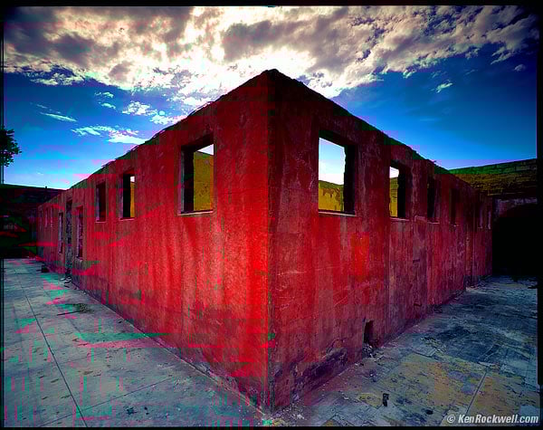
The reason my image above has won so many awards in so many countries and is picked continually as one of my best images is because of its strong structure.
What is this structure? It is the broad underlying colors, shapes and contrasts between light and dark upon whose structure all the other far less important details lie.
In this image, we have a big red diamond in the middle. It is surrounded by blue-gray. The big red rectangle is the obvious, positive space. The blue-gray around it is called negative space.
Red jumps out at you, especially when put in front of blue. Red does that.
I used an ultra-wide lens. Ultra-wide lenses get darker in the corners, an effect called falloff. This makes the center relatively brighter, adding emphasis. This central emphasis, in addition to being red, is what grabs your eye and pulls you in from a mile away.
This is what makes this shot a winner. Nothing else matters much compared to the way the big red diamond grabs you.
Only after its caught your eye does anything else matter.
This is crucial: if this image didn't catch your eye like this, it wouldn't mean much.
Once a photo has caught your attention, it needs to have details to keep the eyes interested. This is easy. Every photo has details. The problem is how few photos have any sort of underlying structure to catch your eye in the first place.
In this case, the less important details are the yellow peeking out from behind the red, the clouds swooping out from the center, the crud on the concrete at your feet and the reinforcing mesh seen peeking out of the top of the red wall, at least when printed at gallery size.
This photo, like all good photos, is about shapes, colors and balances. It has nothing to do with the fact that the actual subject was an abandoned, burnt-out bathhouse with no roof.
It's nice that I shot this on 4x5" film so that viewers can see every detail on every dead bug on every paint chip on the ground, but if the strong structure didn't grab the eyes in the first place, the viewer would just move on to the next image on the wall of the gallery.
Most photographers snap photos, paying attention only to the details, but ignoring the far, far more important fundamentals. Most photographers don't even know that there are fundamentals!
These fundamentals are the largest, obvious elements of light and dark, colors and shapes.
You have to get this underlying structure right, otherwise the photograph has no basis on which to stand.
If I had made this shot in black-and-white, there would be little to no contrast between the red wall and the blue. The blue is often lighter than the red in this photo, so even using a red filter in B&W would not have gotten me what I needed to catch your eye. In color, to red takes charge and makes this shot successful.
You should be able to defocus your eyes and look at your image from a hundred feet away, and the basic organization of elements within your frame should still be obvious.
If your image goes away as a thumbnail-sized image, it has no structure. It sucks. If it doesn't jump out at you as a thumbnail, you've made a boring image, regardless of how big or detailed you print it.
The shot above still grabs people, even as a thumbnail. As a thumbnail, people want to click it and see what's going on. It's not just another gray square.
If it doesn't sing as a thumbnail, no amount of Photoshop, HDR or gigapan stitching will give it any more structure. It will still suck as hard, no matter how much time you waste on your computer. You have to get it right in your camera.
The one thing you can do later is to burn and dodge. This means lightening and darkening different parts of the image to emphasize what's important, and deemphasize what's not.
Photographs without the basics are boring. An image, be it a photograph, painting, sketch or gigapan, is meaningless unless its basics are right.
The reason so many photos are so bad is because there is no underlying structure. Bad photos may be loaded with details, but forget to get the big, broad basics of composition, light and color correct.
Sadly, most photographers are blind to the basics, and only by chance when the basics come together do they get a good shot.
More sadly, since so few photographers are paying any attention to the basics, even when they do get a good shot, they don't know why it looks good, so they can't reproduce it.
When you learn to look for the basics first, and can get the basics of composition down, you'll be able to shoot anything, anywhere, with any sort of cell-phone camera, and walk away with the images everyone else covets.
People who are blind to the basics are the great majority of people who keep throwing more money at more cameras, and never get any better pictures.
It's the basic underlying composition that makes or breaks an image.
It's not about the subject
Here's another secret: in photographic art, it's never about the subject.
It's always about the underlying compositional structure. Subjects that may be there are chosen because they support or create a structure, not the other way around.
What a subject does in real life is irrelevant. In a good photo, subjects are chosen to provide the shapes or colors we want to lay down the basic design of an image.
What might look like a door is really only used because it's a rectangle, or two squares. If we shoot it at an angle, now it's a trapezoid, or a truncated triangle.
An ocean liner? If you use the whole thing in a successful photo, its because it's used as a shape that works with whatever else is in the frame.
This is why I'm known as a toilet photographer. I don't care what my subject might be in real life. When I look for photos, I'm looking for shapes and colors. It just tends to happen that bathrooms and garbage cans tend to get lit up in great light at the end of the day, so if they're in good light, I shoot them.
The actual subject is meaningless because you're mind's subconscious eye can't even recognize it from a hundred feet away.
Your photograph must have a strong enough structure so that structure is obvious to the subconscious That's how you grab people to get the ooohs and aaahs.
The actual subject doesn't matter. Your choice of a subject should be made to give a strong underlying design to the image. What that subject is or does consciously is irrelevant. As far as photographers are concerned, photos subjects are used purely as big colors and shapes, exactly as you'd cut these colors and shapes out of construction paper to make a composition.
Composition
When composing, ignore details.
Be sure to exclude everything not directly contributing to the image.
As you compose, only look at the boldest, broadest and most basic lines and shapes in your image in the most overall and general sort of way.
I often look away from my finder to see the finder out of the corner of my eye. This lets my brain ignore details and what the conscious subject might be, and hopefully see the image's far more important underlying structure more clearly.
The only thing that matters are the bold, broad strokes. It's a photograph, not a painting, so duh, the details will take care of themselves.
The broad strokes won't. You, and you alone, have to force them exactly where you want them before you take the picture.
Nothing in an image is what it seems. Even though viewers might say "that thing in the corner is a rain boot," when composing, it's a yellow shape you are using for no reason other than as a color blob in your image.
When composing, forget the subject. You are using every item in the image as a compositional element, exactly as you'd arrange pieces of cut-out construction paper to make an interesting composition.
Move the camera forward or back to fit your elements as you want them.
Move left or right, and especially use the forgotten dimension of moving up and down, to re-arrange items in your frame as you want them.
See also Composition.
Only when you get these basics right does anything else below matter.
Eye Path
Our eyes are first attracted to the brightest, or the contrastiest, or the most colorful part of an image.
After we've caught the eye, the eye starts to wander around and see what else there is to see.
After you've caught a viewer's eye, you have to be sure that it stays in your image, and doesn't wander out.
Keep details out of the corners, and be sure that important elements aren't cut by the frame edges. How do we move mountains? Easy: turn the camera, or walk a few steps left or right to move them relative to the tree in your frame.
This is one of the may reasons why HDR and other stitching and stacking hobbies are so bad. You need to spend you time looking for the best position from which to make a shot. Never spend 20 minutes making multiple exposures unless you spent at least twice that much time looking for the best point of view.
By keeping corners dark, it keeps our eyes from wandering off the edges. By keeping details out of the corners, it also keeps our eyes from leaving the frame.
Look at any real painting, even motel art. You'll see that even motel artists know not to run details off the edge of the frame. Look at nature paintings, and you'll usually see that the leaves on the pond magically are aligned so that none of them are cut by the edge of the image. It's the same for trees and rocks: it's not by chance that they usually are painted in such a way that they don't cross the image's edge.
We who read English usually start at the top left, and work our way to the bottom right. At the very least, we read an image from left to right. It's weird if a car is driving to the left; that's backwards.
Our eyes last look into the dark areas. They only get there if the image was good enough catch our eye in the first place, then had enough lighter details to keep us looking around for a while, and be good enough that we're still curious enough to see what is in the shadows.
Anther reason HDR sucks so bad is because it eliminates light and dark. An all-gray, all-busy image has no structure, and is boring.
Burning and Dodging
The most important image editing, other than cropping, is selective lightening and darkening, called dodging and burning.
Lighten the parts of the image to which you want to add emphasis, and to which you want to attract the eye first.
Darken the parts of the image that are irrelevant, or lead the eyes away from the important part.
How do we keep the corners dark to keep eyes from wandering off? Both by composing the image that way, and by darkening the print edges later in the darkroom. Ansel Adams called this important technique "edge burning."
Always be subtle in your burning and dodging. The instant it becomes obvious that you've used it, the photo is trash. The effect is the strongest when you keep it subtle enough to stay in the subconscious.
I usually use about half the strength of what I first think I want to use when burning and dodging. Otherwise, if it becomes obvious, and destroys the effect.
Distractions
When the USA invaded Iraq again in 2003, President George Bush was deadly clear: you're either on our side and doing your part to support the coalition's annexation of Iraq, or you are the enemy. In other words, there are no neutral parties. If a country feels like it can ignore helping the coalition and stay out of it, it has just made itself an enemy of the United States.
Photographs are the same way. Anything that isn't directly helping the composition takes away from it. It's just like editing: the fewer words you use, the better the writing.
Details that don't add to the overall structure of the image make it weaker. See the annoying tree in the sky on the left? I has nothing to do with the rest of the image. I always crop that out, otherwise, viewer's eyes keep going back to it, which pulls eyes off the image. It is a distraction, which makes for a poorer image.
If you aren't seeing how much worse the image is with the tree silhouette in it, cover the left side of the image to remove it, and it gets twice as strong.
Punchline
The best images have a punchline.
Who wants to hear a joke or see a movie without a good ending?
A punchline is what you find after you look around the image.
A punchline doesn't have to be hidden. A punchline can be as simple as a row of soldiers, and one at the end is doing or wearing something different.
Double Punchlines
Everyone has set up their camera in front of a colorful doorway and waited for someone interesting to walk by.
Every hobbyist has nice photos of street scenes with a cleverly placed person or cart whizzing by.
So what? That's a minor punchline.
A single punchline is something simple, like a photo of a train window, and the last one has someone looking out. Big deal.
A double punchline is when you have something in the photo reacting to something else in the photo.
For instance, a master like Jay Maisel has photos where you have a train window with an obligatory punchline of a person looking out one window, but then you'll notice someone in the next car looking back in surprised response to the first person!
Gesture
Gesture means the position of hands. In an image, gesture can also mean what is said by the positions of inanimate objects that mimic our hands or faces.
Gesture means a photo with someone making a funny face in reaction to something else going on in the frame. For instance, a good photo is one where you first notice something odd, and then you notice someone else in the photo reacting to it. That's both paying attention to gesture, and gives us a punchline.
Gesture applies to inanimate objects. You can find arrangements of things that suggest the same things that can be expressed facially and with hands.
Animators know how positions of hands and eyebrows can say everything. If you find compositional elements which mimic these, your photos can express the same emotions.
Most of the time, gesture refers to facial and hand expressions.
Color
Books have been written about color. Go to your library, or an art library, and read them. I'll only touch the basics here. I have another page about color.
Warm colors, red, orange and yellow, appear to move forward towards the viewer. Our eyes are attracted to them first.
Cool colors, greens, blues and violets, recede away from the viewer.
An easy way to make your image three-dimensional is to have an orange object in front of a blue background. Movies do this all the time.
Put orange on blue, and in comes forward.
Put a red building on blue as I did, and the red comes out and hits you.
Colors need to be in harmony. There are a zillion ways to analyze this, but as a photographer you have it easy. What looks good is good. Painters have it harder, since they need to design and synthesize their colors from their own imaginations.
Colors tend to be harmonious when you have two colors balanced from opposite sides of the color wheel. You can get fancy and have to variations of a similar color balancing another opposing color. You can try to have three colors, all equally spaced on the color wheel.
I'm simple: I like brilliant orange, as lit by the late afternoon sun, highlighted against the dark blue of a sky.
Warm colors get us riled up.
Cool colors are peaceful.
Follow your own eyes, and read lots of books if you want to know the formal analyses.
If you shoot color, you must pay attention to color. You can't just shoot in color and expect the colors to come out magically wonderful. You have to look for them.
Artists look at my work and realize the subject is the colors themselves.
If color doesn't add to your image, don't shoot color. Shoot black-and-white.
Don't shoot color because it's what your camera does at default. If you aren't actively going to be sensitive to colors, don't shoot them.
Lighting
Lighting is the most important technical issue in photography. Pro photographers pay close attention to it, while hobbyists sadly ignore it.
For our purposes here, lighting is the biggest contributor to light and dark, to colors, and to shapes and lines.
The direction of light and shadow defines our lines and shapes.
Lines, colors, shapes, light and dark are 99% of our image. Lighting is everything.
Close One Eye
Life is three-dimensional. Not only is it three-dimensional, it has sounds, smells and a whole lot more.
It is extremely difficult to package a life experience into a flat, rectangular print.
I love photographing around trees and nature, except there is a huge gotcha: the reason we like to shoot around them is because of the 3D effect, but since our photos are flat, we can't capture that.
When shooting, always remember close one eye as you view any potential scene.
Close one eye, and suddenly a scene, alive with trees, bushes, rocks and nature, collapses into a boring mass of crap. This is how your photo will look, at best.
Don't move as you look through one eye. If you do this while walking, your brain will still figure it out and piece it back together as 3D.
Stop, hold still, close one eye, hold out your hands to make a rectangle, and that's, at best, how your photo might look.
Pretty boring, eh? Sorry to rain on your parade, but this is another reason most people's nature shots look so bad.
What looked great to their stereo vision wasn't composed with any compositional elements that could lead to an interesting image. Once the 3D effect is removed, it collapses to the random jumble of garbage it is.
If you remember to view through one fixed eye, you can train yourself to pass on images that won't work as flat photographs, and learn to find subjects that will work as strong images.
This is important: by skipping what you now know will look awful, you'll start getting a much higher percentage of keepers. As time progresses, you'll get better at recognizing what makes a keeper, and start turning out a lot more good work.
When nature looks dull when seen with one eye, start arranging your composition to say something. When you can do this, you are becoming a photographer.
Never Imitate
No one can be as good at being Ansel Adams or Jack Dykinga or Jay Maisel orDavid Muench or Richard Avedon or whoever, as they were.
Don't even try.
Only you can be you. None of them can ever be as good at being you as you are.
The biggest difference between them and you or I is that they got over worrying about technique, and put all their efforts into looking for good images. David Muench doesn't even look for images, he just goes out with no preconceived notions and goes wherever he feels like he's being guided. Muench pays most of his attention to picking up on whatever signals he's picking up from the landscape. They all go out with open minds and see what they see.
Leading photographers never go out with navigational coordinates attempting to find the same location some other shooter used before.
Screw convention. It's the fastest way to boring images. Don't ever try to shoot anything based on what you think might play well in a contest or might be something other people might like.
Follow your own passion and excitement. Shoot what excites you. If you can capture your own excitement, you just got a good image.
Think about this: if the guy who made the shot you admire didn't start out with a GPS map printout, how on Earth do you expect to do any better yourself when you get there in different conditions? The guys who shoot nature know the light and conditions are far more important than the location. If they do find a location they like, they may have to wait years to get the right light there.
Don't expect that on your two weeks of vacation that you can drive up to the same spot and duplicate years of waiting effort. The way these guys find their pictures is by keeping their eyes on what's in front of them, not a map. When magnificent conditions hit they shoot what's in front of them at the time.
You Can't Go Back
When the conditions are right, shoot.
As you learn to be more observant, the more you'll realize how nothing stays the same, even for a minute.
Lighting changes, and cars pull up in front of your subjects. People sit down in front of you, or they leave.
If you have to fiddle with a tripod, you're dead.
Shoot today. Shoot NOW. You can't go back next week.
The light will never be the same.
The building might not be there.
The shot at the top of the page?
It got repainted the next day. Those colors will never be there again.
No big deal: just keep your eyes open and there are newer, better things to shoot all the time.
FARTing
Be sure to FART before each picture.
Summary
If you can learn to get the basic compositional structure of your images right, you will be making much better images than most photographers ever do.
Most photographers just point and shoot, and hope something turns out. Regardless of how advanced their equipment and how exotic the location, failing to pay attention to the basic design elements results in ho-hum pictures, no more than thoughtless snapshots.
By paying rapt attention to the underlying shapes and forms which make up your image, your images will stand above the rest.
Photos always have details. The camera does that.
The camera can't compose the basics of your image. You, and you alone, have to do that.
If you get the basics right, you will make great images with any camera.
If you don't pay attention, you'll get crummy images with every camera, which is why most beginners keep throwing more money at more cameras, and get the same results.
I pay a lot of attention to my camera's position. Even fractions of an inch (millimeters) can make or break a photograph.
You can't do any of this after you've snapped your photo.
If you want to try HDR or other silly stacking or stitching shenanigans, be very sure that you are already enough of a master to know exactly where and when to plop down your tripod, since if you don't get that right, nothing will be any good.
Thanks for reading!